UX Case Study: ‘Add Content’ feature for Google Calendar Events
Overview
The GA student experience can require long working hours on campus and sometimes on weekends. At times, this can result in issues with time management while trying to maintain a school/life balance. What evolved from my design process was the Add Content feature that can be added to Google Calendar app on iOS and Android phones.
Users & Audience
Users who will be using this feature are General Assembly students. Each of the General Assembly students goes through the same experience: we come here on the first day, full of energy, hope and eagerness. By Wednesday, we at the point of breaking down. We have so much work and the first part of the Unit 1 already due on Thursday. In the craziness of the first few days users are not prepared for what is coming, so they might not be as organized. Some lose their papers, some didn’t listen in class and some just have a problem with being organized overall. They need help. They believe that having some sort of the organizing feature in Google Calendar (since that’s what the General Assembly is using for time management) app on their phone will help them.
Roles & Responsibilities
Since, this was a solo project, I had to be a Jack-of-all-trades. I was the researcher, synthesizer, ideation creator and a final delivery presenter. Most of the work was done on NYC GA campus, as well as many hours spent at home in great state of New Jersey. I’ve used User Interviews and Affinity Mapping to go through the first part of the project to better understand my users and create a proper Persona that will be using the Add Content feature. As for tools themselves, I’ve user Sketch, InVision, Google Slides and a little bit of Photoshop for some slight image editing.
Scope & Constraints
The timeframe for the whole project was 2 weeks. The very first 2 weeks of our time here at General Assembly. First week was spent on research and synthesis, while second week was spent on ideation and delivery process.
Regarding budget, it wasn’t a factor because this was our first project and we were learning as we go through each step of the process for UX Design.
The roadblocks that I’ve hit personally were very tight deadlines, with time spent on weekends, so basically I’ve spent my first 2 weeks barely sleeping, doing my research and going through every step of the project with the most attention I could give to it.
Process
To start off the project I had to interview some of the students here at General Assembly. To do that I had to come up with Discussion Guide that helped me to get better data from each of the interviewees and thus creating a better Person later. Below you will find my Discussion Guide (the questions I’ve asked and followed up with questions that were not in the guide during the interview to get more information about each user) that I have used.
1. GOAL
To understand how user manages his/her/their school/life balance and what do they use for it
2. OPENING QUESTIONS
What’s your name?
What do you do?
What is your background/demographic information?
How old are you?
3. TOPIC-SPECIFIC QUESTIONS
- Here at GA students have to manage their time effectively. Do you use anything that helps you to manage your work/life balance?
2. What are the apps that helps you manage your life?
3. Can you tell me how this app helps you on day to day basis?
4. What are the features of the app that you prefer to use over other features?
5. With a need for personal time, how do you find time for your own relaxation or anything that makes you relax?
a) Follow up — How did you use the app in the past week for your meals
b) Tell me about how do you use the app to plan out your rest.
c) What hobbies do you have in your personal time that the app helps to manage?
6. Please tell me how do you manage family time?
7. With GA workload you have, how do you use the app to study on your own?
a) How do you use it for class assignments?
8. Do you use the app or feature for anything else outside of what I have discussed? What would be helpful to be added to the app?
9. Is there is anything we have not touched on or that you’d like to talk about?
Affinity Mapping
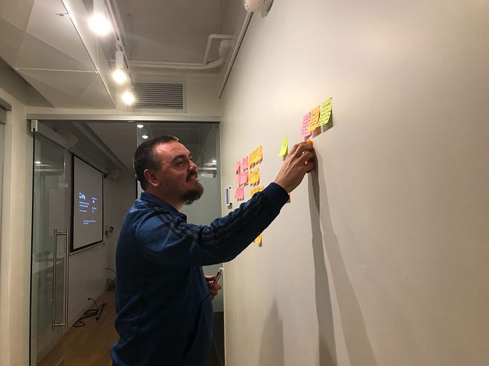
After I concluded 3 interviews, I’ve created an Affinity Map that helped me better understand similar trends in answers among the interviewees and do synthesis of all the answers I got. Below are some of the images I got during this stage, as well as the “I” statements I generated from those trends (I’ve removed some that do not relate to the topic and left those that I’ve focused on to develop ideas for the feature).
· I have limited time daily for scheduling my life
· I only use digital products (phone and phone apps) to help me organized my life
· I like to use the app to be better organized in my daily life
· I want to have more visual control in my apps over some UI elements, as well as functionality

From these I statement and the user research, a User Persona, Jose Fernando have emerged.

Creating a Persona really helps provide a common understanding and forge a deeper understanding of the user. With Jose in mind, I came up with a clear problem statement:
People (students) who study at General Assembly look for the ways to have a better school/life balance.
General Assembly student has a very busy schedule during the day and wants to see if he can keep a better track of his GA homework assignments. How might we help him better manage his GA assignments while on campus?
Design
With all of this in mind, I wrote down a bunch of ideas: some bad, some good and after a short exercise with one of my classmates, I decided to go with something pretty simple: user can upload pictures to the new or current event that is already in Google Calendar to make sure they don’t lose their assignments and can do their work. Here is the low-fidelity prototype I came up with:
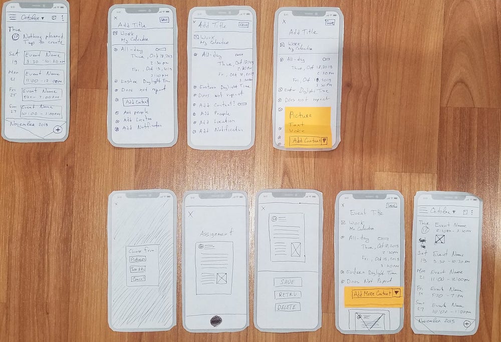
First screen on the top left is the original Google Schedule view and it has a default view that I can’t really change. Then 3 screens to the right of it, are 3 ideas of how my feature should look like. The one with the yellow sticky note was the one I went with. Sticky note is basically a dropdown that user can click and 3 options will drop down: Picture, Text and Voice. Five screens below that is the work flow of how the addition of the image to the Event will work.
After I’ve completed these sketches, I did a user testing with 3 of the GA students. Here is the Scenario and Task I asked users to perform:

This gave me some very interesting results and ideas to add to the mid-fi wireframes later. Here are some of the findings:
- Users want to use Text as the very first option to add, not Picture. So I’ve moved the Text to be the first option in dropdown, so the user can select it right away.
- Users usually already have some pictures of the assignments on their phones, so every user selected Pictures as first choice to add a picture from the their Gallery. This also gave me an idea to rename Pictures to Gallery, since every user familiar with that terminology.
- Users wanted a URL function to be added to the list in dropdown. So later in mid-fi prototype I’ve created in Sketch, I used that as another option.
Below is a presentation slide I’ve used to basically summarize what I said above visually.

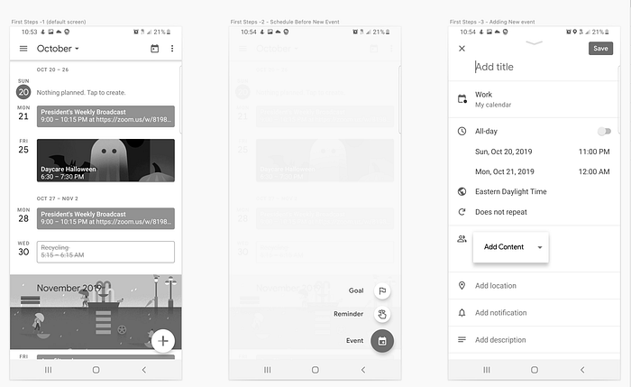
So when I started to work on mid-fi prototype using Sketch I’ve used a lot of data I got back from the user testing and created this work flow for the feature that basically outlined how each Content Type works within the dropdown when user clicks on it.

These are the first 3 steps you need to complete to get to the Add Content dropdown feature:
If you select Text in the Add Content you will get this work flow:
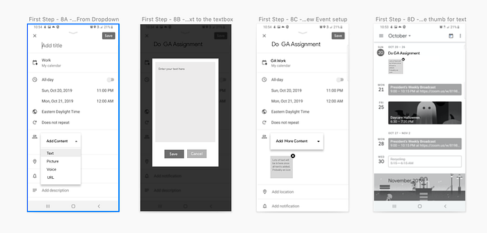
If you select Picture, here are actually 2 work flows you get, because you can select a Picture from Gallery or take a new Picture:

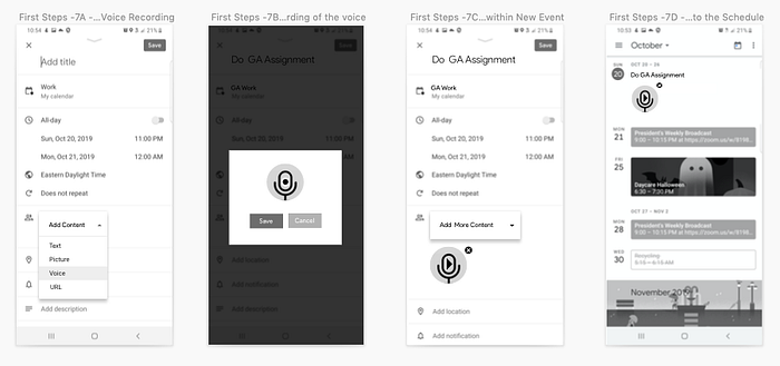
If you select Voice, you will get this work flow:
Finally, here is the last option to Add Content dropdown: URL

And to visually to give you an idea how user will go with every of each steps, here is a small video showing every step:

With these mid-fi wireframes, I’ve asked 5 potential users at General Assembly campus to test it out for me using a prototype I’ve made in InVision and tested it on my phone and same Scenario and Task I’ve used for paper prototypes.
Usability Testing Results
Score: Minor Issue
2 out of 5 users did not complete the task on the first try, simply because they did not see the Add Content dropdown right away and just created an event, without adding anything. They did complete their task on second try and were surprised that they didn’t see it before.
3 out of 5 users successfully added content to the events and thus effectively manage their time while they on GA campus with GA assignments due on certain dates
All users tried to add another file type right away to the event after they added one of the Add Content options, but since I was on time constrains with this project I did not have those additional screens (even though I’ve already thought of that as I finished the mid-fi wireframes). I’ve verbally explained to the users what would happen if they try to add another Add Content type and how it would work.
One of the users suggested another Add Content option: Video. Since that user was a SEI (Software Engineering Immersive) student, we briefly talked how it would work on backend side and decided that might not be a best option.
Analysis
Users seem to be very impressed with how easy it was to follow and complete necessary steps in order to complete the task. Those who did not completed, tried it on the second try and loved the idea of the feature.
Recommendation
Make feature more prominent, maybe have a bit of color for users to see it right away or move the Add Content dropdown a bit higher in hierarchy of fields.
Ease of Use and Satisfaction
I got an average of 4 out of 5 (1 being hard to use and navigate and 5 easy to use and navigate). All users said it was very easy to do everything they wanted and satisfied how the feature performs.
Outcome
Overall, I’ve helped Jose to keep a better track and manage his GA homework assignments, while being on General Assembly campus through an Google Calendar feature I’ve called Add Content.
Next Steps
- Create hi-fidelity prototypes
- Test those prototypes with GA users
- See if more features need to be added
- Deliver the final product to the GA and Google to see if the implementation can happen and this new product feature can be shipped in next update.
- Recruit GA students to be beta-testers for this possible new feature from Google
Leanings:
Since this was my first complete UX process project ever, I would probably tried to get more interviewees for my very first 1x1 interviews. I would get more data that would’ve gotten me even better understanding of GA students.
To summarize, even though I’ve gotten only 3 users to complete the task they needed to do out of 5, each of the users was impressed how easy it was to use the feature and understood how each step works without me trying to explain it to them.
Where did the project leave off?
Event though I mention this this in Next Steps section above, I believe that getting this feature to Google development team, may help some people with less-than-average organizational skills to manage their lives better. Presenting this idea to Google team would be an amazing opportunity to further work on this project.
“The only real mistake is the one from which we learn nothing.” — Henry Ford
